반응형 footer를 content 높이 상관없이 항상 하단에 고정하는 기능을 구현했다.
"footer 하단 고정"이라고 구글링 해보면 많은 예제가 나오긴 하는 데 다 footer 높이가 고정된 상태에서 하단에 고정시키는 기능이라서 다른 블로그 css 참고 + js를 첨가하여 기능을 구현했다.
(아래 블로그에서 css 부분 참고함)
footer 하단 고정
항상 html 작성할때마다 footer가 날 괴롭힌다. 이상하게 구글링을 할때마다 자료들이 2% 아니한 50% 이상 모자라다. 조금더 완벽하고 컴팩트한 방법이 있어 작성한다. 구글링으로 나오는 자료들은
velog.io
과정을 요약하자면 아래와 같다.

1. Header, Content, Footer UI를 만들어 준다. (Header는 고정적, Content는 height: auto, Footer는 반응형)
* height: 100%와 height: auto의 차이점
: height: 100%는 부모 태그 값에 따라 영향을 받고, height: auto는 자식 태그 값에 따라 영향을 받는다고 한다.
[css] height:100% vs height:auto
나는 평소 이미지에 width:100%를 주면 height값이 자동주어진다고생각해 꼭 필요한경우가 아니라면 별도의 값을 지정해주지않았다. 사수가 width값이랑 height:auto를 주라는 조언을 해줘서 100%하면안
dubaiyu.tistory.com
(Next.js 기준)
2. globals.css (전역 css) 코드
html,
body {
    height: 100%;
}

.contentWrap { // content 영역
    min-height: 100%;
    position: relative;
}
* .contentWrap은 footer와 형제 관계로 설정한다.

3. footer html/js/css 코드
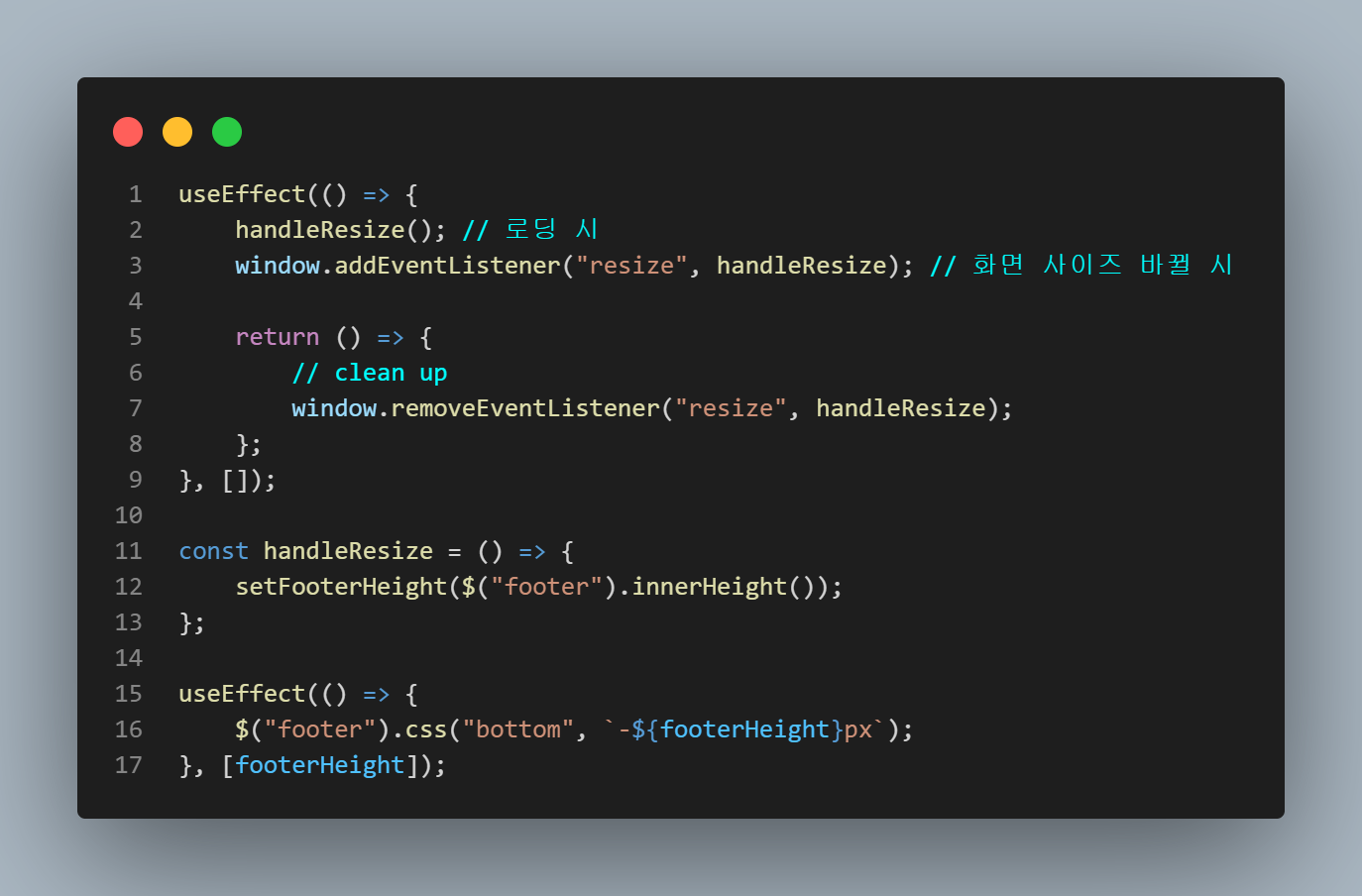
resize 함수를 사용하여 화면 사이즈가 바뀔 때마다 footer의 높이를 가져와서 footer bottom에 "-{footer height}px"만큼 아래로 내려가도록 설정했다.
import { useEffect, useState } from "react";
import $ from "jquery";

const Footer = () => {
    const [footerHeight, setFooterHeight] = useState();

    useEffect(() => {
        handleResize(); // 로딩 시
        window.addEventListener("resize", handleResize); // 화면 사이즈 바뀔 시

        return () => {
            // clean up
            window.removeEventListener("resize", handleResize);
        };
    }, []);

    const handleResize = () => {
        setFooterHeight($("footer").innerHeight());
    };

    useEffect(() => {
        $("footer").css("bottom", `-${footerHeight}px`);
    }, [footerHeight]);

    return (
        <footer className="footer">
            <div className="container-fluid">
                <div className="main-container">
                    <div className="row">
                        <div className="col-md-8"></div>
                        <div className="col-md-4"></div>
                    </div>
                </div>
            </div>
        </footer>
    );
};

export default Footer;
.footer {
    width: 100%;
    padding: 58px 2% 2px;
    background: #0e1726;
    color: #fff;

    position: relative;
    transform: translateY(-100%);
}'🧠 지식창고 > 기능' 카테고리의 다른 글
| document scroll event 대신 new IntersectionObserver 사용해보기 (0) | 2023.03.13 |
|---|---|
| [react-datepicker] 달력 구현 및 주말/양력 휴일/음력 휴일 비활성화 하기 (0) | 2023.01.20 |
| [Next.js] 주소 입력 → 위/경도 출력 → 지도 출력 (카카오 geocoder/지도 api) (0) | 2023.01.10 |
| css 전역화 시키기 2️⃣ (ver. :root) (0) | 2023.01.06 |
| css 전역화 시키기 1️⃣ (ver. ThemeProvider) (2) | 2023.01.06 |


댓글