728x90
- 패키지 설치
설치 할 패키지 없습니다 😊
- 기존 코드
https://www.geeksforgeeks.org/how-to-create-a-toggle-switch-in-react-as-a-reusable-component/
How to Create a Toggle Switch in React as a Reusable Component ? - GeeksforGeeks
A Computer Science portal for geeks. It contains well written, well thought and well explained computer science and programming articles, quizzes and practice/competitive programming/company interview Questions.
www.geeksforgeeks.org
위 사이트를 참고해서 구현 했습니다.
더보기
// ToggleSwitch.js

import React from "react";
import "./ToggleSwitch.css";

const ToggleSwitch = ({ label }) => {
  return (
    <div className="container">
      {label}{" "}
      <div className="toggle-switch">
        <input type="checkbox" className="checkbox"
               name={label} id={label} />
        <label className="label" htmlFor={label}>
          <span className="inner" />
          <span className="switch" />
        </label>
      </div>
    </div>
  );
};

export default ToggleSwitch;
// ToggleSwitch.css
.container {
text-align: center;
}
.toggle-switch {
position: relative;
width: 75px;
display: inline-block;
text-align: left;
top: 8px;
}
.checkbox {
display: none;
}
.label {
display: block;
overflow: hidden;
cursor: pointer;
border: 0 solid #bbb;
border-radius: 20px;
}
.inner {
display: block;
width: 200%;
margin-left: -100%;
transition: margin 0.3s ease-in 0s;
}
.inner:before,
.inner:after {
float: left;
width: 50%;
height: 36px;
padding: 0;
line-height: 36px;
color: #fff;
font-weight: bold;
box-sizing: border-box;
}
.inner:before {
content: "YES";
padding-left: 10px;
background-color: #060;
color: #fff;
}
.inner:after {
content: "NO";
padding-right: 10px;
background-color: #bbb;
color: #fff;
text-align: right;
}
.switch {
display: block;
width: 24px;
margin: 5px;
background: #fff;
position: absolute;
top: 0;
bottom: 0;
right: 40px;
border: 0 solid #bbb;
border-radius: 20px;
transition: all 0.3s ease-in 0s;
}
.checkbox:checked + .label .inner {
margin-left: 0;
}
.checkbox:checked + .label .switch {
right: 0px;
}
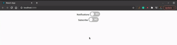
- 실전 프로젝트에 맞춰 변형한 코드
더보기
// src/elements/Toggle.js

import React from "react";
import Switch from "@mui/material/Switch";

const Toggle = (props) => {
  return (
    <>
      {props.label}
      <div className="toggle-switch">
        <input
          type="checkbox"
          className="checkbox"
          name={props.label}
          id={props.label}
          checked={props.notice}
          onChange={() => {
            props.setNotice(!props.notice);
          }}
        />
        <label className="label" htmlFor={props.label}>
          <span className="inner" />
          <span className="switch" />
        </label>
      </div>
    </>
  );
};

export default Toggle;
// src/shared/App.css
.App {
text-align: center;
}
::-webkit-scrollbar {
/* 스크롤바 막대 너비 설정 */
width: 3px;
}
/* -------------- dropdown ----------------- */
::-webkit-scrollbar-track {
background-color: none;
}
::-webkit-scrollbar-thumb {
/* 스크롤바 막대 높이 설정 : 현재가 제일 작은 값 */
height: 10px;
border-radius: 100px;
box-shadow: inset 0 0 10px gray;
}
/* -------------- dropdown ----------------- */
/* -------------- toggle ----------------- */
.container {
text-align: center;
}
.toggle-switch {
position: relative;
width: 50px;
display: inline-block;
text-align: left;
top: -3px;
}
.checkbox {
display: none;
}
.label {
display: block;
overflow: hidden;
cursor: pointer;
border: 0 solid #bbb;
border-radius: 20px;
}
.inner {
display: block;
width: 200%;
margin-left: -100%;
transition: margin 0.3s ease-in 0s;
}
.inner:before,
.inner:after {
float: left;
width: 50%;
height: 30px;
padding: 0;
line-height: 36px;
color: #fff;
font-weight: bold;
box-sizing: border-box;
}
.inner:before {
content: "";
padding-left: 10px;
background-color: #fbc037;
color: #fff;
}
.inner:after {
content: "";
padding-right: 10px;
background-color: #bbb;
color: #fff;
text-align: right;
}
.switch {
display: block;
width: 20px;
margin: 5px;
background: #fff;
position: absolute;
top: 0;
bottom: 0;
right: 20px;
border: 0 solid #bbb;
border-radius: 20px;
transition: all 0.3s ease-in 0s;
}
.checkbox:checked + .label .inner {
margin-left: 0;
}
.checkbox:checked + .label .switch {
right: 0px;
}
/* -------------- toggle ----------------- */
.App-logo {
height: 40vmin;
pointer-events: none;
}
@media (prefers-reduced-motion: no-preference) {
.App-logo {
animation: App-logo-spin infinite 20s linear;
}
}
.App-header {
background-color: #282c34;
min-height: 100vh;
display: flex;
flex-direction: column;
align-items: center;
justify-content: center;
font-size: calc(10px + 2vmin);
color: white;
}
.App-link {
color: #61dafb;
}
@keyframes App-logo-spin {
from {
transform: rotate(0deg);
}
to {
transform: rotate(360deg);
}
}728x90
'더 알아보기 > 기능' 카테고리의 다른 글
| React.js에서 쉽게 반응형 웹 페이지 만들기 → react-device-detect (0) | 2022.01.10 |
|---|---|
| PWA(Progressive Web App)란? + 적용하는 방법 (0) | 2022.01.08 |
| Toggle Switch 기능 만들기 [1탄] (0) | 2021.12.27 |
| Modal 팝업창 만들기 (0) | 2021.12.27 |
| 녹음/녹음 파일 재생 + 서버에 녹음 파일 보내는 방법 (4) | 2021.12.27 |


댓글